g'Day All
Seriously though, for such an important step in the establishment and
evolution of the newly merged organisation; the creation of "an identity
logo", the process should have been much more inclusive and the result
more ID focused.
To be accepted by the majority, the design for a new logo probably
should have been put to all members, probably by way of a design
competition; the entrants judged by a combined panel of committe members
from both previous clubs.
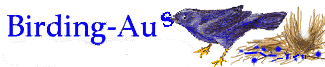
My first thought/impression/emotion of this new logo was amusement. Is
it a cynical representation of something plastic. With no legs and its
head turned back, it is reminiscent of a beachwashed bird carcass
tangled up in a blue towel or a shot duck with its legs blown off. As
others have stated, an Emu Wren would have been a clever and appropriate
nomination
In any case this new logo does not look Australian but appears very
Euro. Perhaps to remind us of the old BA, at the very least it needs
legs with bright orange flags attached.
Regards
Ian May
St Helens, Tasmania
===============================
To unsubscribe from this mailing list,
send the message:
unsubscribe
(in the body of the message, with no Subject line)
to:
http://birding-aus.org
===============================
|